Stop Building
Charts Manually.
Ask for any chart in plain English—AI generates it instantly, backed by Fundstrat's proprietary data and research.
No more Excel wrestling. No more data hunting. No more formatting nightmares. Just tell our AI what you want to see, and watch it appear in seconds—ready to share with clients.
Describe What You Want.
AI Does the Rest.
Our AI Chart Generator understands financial concepts, market relationships, and analytical frameworks. It doesn't just plot data—it understands *what you're trying to communicate*.
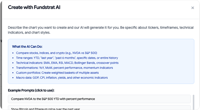
Step: 1
Describe the chart you want to create
- Compare stocks, indices, and crypto (e.g., NVDA vs S&P 500)
- Time ranges: YTD, "last year", "past 6 months", specific dates, or entire history
- Technical indicators: SMA, EMA, RSI, MACD, Bollinger Bands, crossover points
- Transformations: YoY, MoM, percent performance, momentum indicators
- Custom portfolios: Create weighted baskets of multiple assets
- Macro data: GDP, CPI, inflation, yields, and other economic indicators
Step: 2
AI Generates Instantly
- Within seconds, AI:
- Pulls the right data from Fundstrat's proprietary sources
- Structures the analysis correctly
- Formats it professionally
- Adds context and annotations (optional)
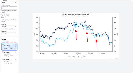
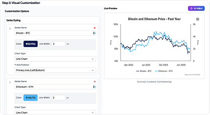
Step: 3
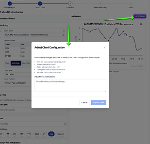
Annotate & Publish
- Fine-tune if needed (or use as-is). Add your branding. Export to PPT, PDF, or chartbook. Share with clients.
Building Charts Shouldn’t
Take Hours.
Too Time-
Consuming
Finding data, cleaning it, formatting it, making it presentation-ready. What should take 2 minutes takes 2 hours.
Limited by
Tools
Excel, Google Sheets, Bloomberg—they're powerful but clunky. Creating custom analysis requires advanced skills and patience.
Data without
Insights
Excel, Google Sheets, Bloomberg—they're powerful but clunky. Creating custom analysis requires advanced skills and patience.
Reformatting
Hell
Every platform has different export formats. Getting charts client-ready means endless tweaking of fonts, colors, and layouts.
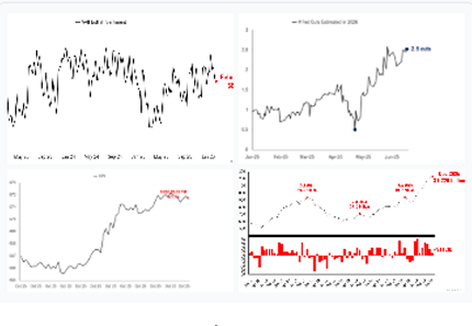
Hundreds of charts. Unlimited
possibilities
Macroeconomic Analysis
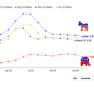
- Inflation vs. equity returns
- US GDP Growth and Interest rate correlation
- Estimated Fed cuts
- Global liquidity trends
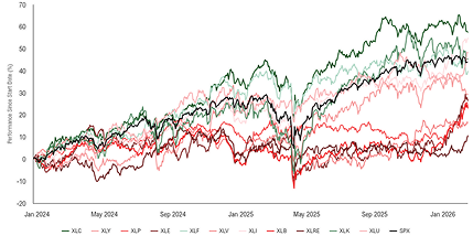
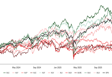
Market Performance & Comparison
- Index performance across time periods
- Sector rotation analysis
- Asset class comparison charts
- Bull/bear market characteristics
Technical Analysis
- Price action with moving averages
- Volume analysis
- momentum indicators
- Relative strength comparisons
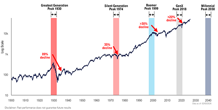
Risk & Volatility
- VIX analysis and correlations
- Drawdown charts
- Custom portfolio vs Index volatility
- Market regime analysis
Correlation & Relationships
- Rolling correlations
- Scatter plots with trend lines
- Multi-factor analysis
- Cross-asset relationships
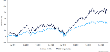
Custom portfolios and backtesting
- Stock baskets vs indices
- Historical earnings and PE ratios
- Valuation frameworks
- Thematic portfolio creation
How It's Different from Other Tools
vs. Excel/Google Sheets
- No manual data entry or formula writing
- Instant professional formatting
- AI understands financial context
vs. Bloomberg Terminal
- Natural language interface, not command syntax
- Designed for client presentations, not just analysis
- White-label ready out of the box
vs. Generic AI Chatbots
- Access to proprietary Fundstrat data and research
- Financial domain expertise built-in
- Creates exportable, presentation-ready charts (not just text descriptions)
From Question to Client-Ready Chart in
Under 60 Seconds
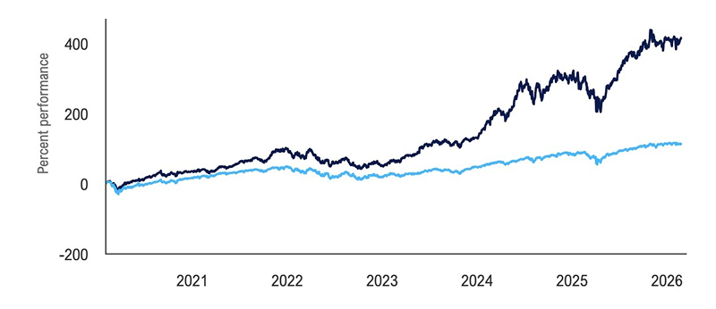
Example 1: Research-Driven RIA
User Ask
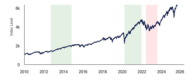
Show me the S&P 500 performance since 2010 with quantitative tightening and easing cycles highlighted in red and green
AI Output
- - 5 Tightening and easing cycles
- - Color coded highlights for each cycle
- - Average return line
- - Data sources cited
Example 2: Client-Facing RIA
User Ask
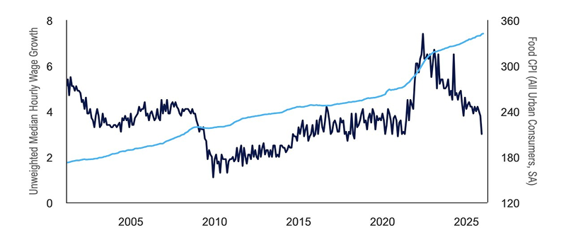
Plot the growth of wages vs inflation of food over the past 25 years
AI Output
- - Two line chart with clear legend
- - Smart dual Y-axis format
- - Clean, client-friendly formatting
- - No jargon, clear labels
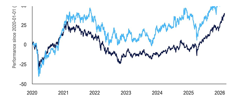
Example 3: Portfolio-Focused RIA
User Ask
Plot a portfolio heavily weighted in tech and healthcare vs S&P 500 since the start of COVID
AI Output
- - Dual-line chart
- - Portfolio vs. benchmark clearly differentiated
- - Customize start dates and stocks with just a prompt
- - Performance context included
Example 4: Growth-Oriented RIA
User Ask
Plot the performance of emerging markets vs small caps since the start of 2020
AI Output
- - Comparative time series chart
- - Punchy visual perfect for social
- - Clean, shareable format
Example 5: Content-Led RIA
User Ask
Plot a portfolio with the most discussed stocks this year. YTD
AI Output
- - Line chart with custom portfolio
- - Average return of basket shown
- - Historical context built-in
- - Toggleable individual stock performance
Different use cases for different
types of reserach
Multi-Series Comparisons
Compare up to 10 data series simultaneously. Perfect for sector analysis, asset allocation, and relative performance studies.
Custom Time Periods
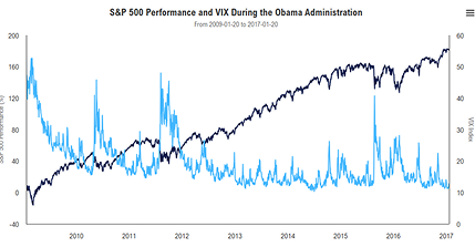
Not limited to standard ranges. Ask for "during Obama administration" or "the tech bubble" and AI understands context.
Conditional Formatting
AI automatically highlights outliers, inflection points, and regime changes without manual intervention.
Intelligent Portfolio Creation
Pulls data from Fundstrat's ever-growing repository of series, with the option to integrate or ask for new data.
Rolling Period Analysis
Moving averages, rolling correlations, trailing returns—all generated automatically with proper methodology.
Scenario Overlays
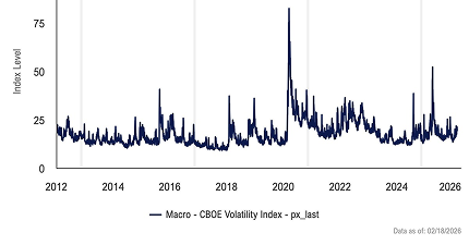
Plot the vix since 2012 and highlight the month when each presidential election took place
Data Source Flexibility
Pulls data from Fundstrat's ever-growing repository of series, with the option to integrate or ask for new data.
Export Optimization
Charts are automatically formatted to your medium of choice, with the option to customize dimensions and style further.
Fits Seamlessly Into Your
Existing Workflow
Chartbooks
Every generated chart can be instantly added to your chartbook with one click. No downloading and re-uploading.
Reports
Embed charts directly into automated client reports. They'll update automatically when data refreshes.
Mobile Ready
Create charts on desktop, review on mobile. Fully responsive for any device.

Your Branding
Seamlessly Integrate Your Brand Into Your Workflow
Your Charts. Your Brand.
Brand Colors
Set your firm's color palette once, every chart uses it automatically
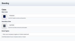
Watermark your charts with your logo
Add your logo to every chart or keep it clean—your choice.
AI Powered
Deliver change to your charts after generation with our AI generated technology
Annotation Control
Keep Fundstrat annotations, hide them, or write your own
Frequently Asked Questions
Not at all. If you can describe what you want in a sentence, you can create a chart.
While the AI can make mistakes, the data that it uses is pulled directly from our database. This means you should rarely see any errors in data retrieval due to the AI.
Yes. You can edit charts after the AI generates them and even after you save or publish them.
It is possible that the request may not be within the scope of its abilities. If that is the case, please feel free to reach out to our data science team who will assist in resolving this.
While you can't add your own data, we are actively searching for new data to add and would be happy to add any series that you would find useful.
Chart generation takes between 20-40 seconds, and we are actively improving our model to speed this process up.
There is no limit to chart creation! Feel free to create and save as many charts as you would like.
Explore More Fundstrat AI Features
Chartbook
Builder
Combine your AI-generated charts into professional chartbooks
Fundstrat
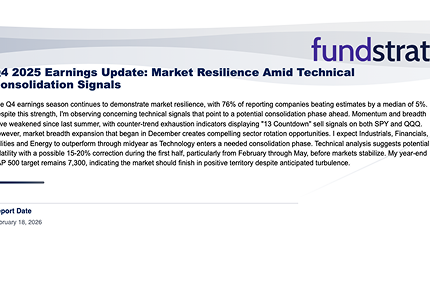
Annotations
Add Tom Lee's insights to your charts automatically
AI Market
Intelligence
Chat with markets beyond just chart creation
Automated
Reports
Generate full client reports with AI-created charts.